Showing posts sorted by date for query renoir. Sort by relevance Show all posts

Monday, July 03, 2023

The Sophie Blackall saga continues

It's been a few years since I checked in with my arch-nemesis Sophie Blackall, the two-Caldecott award-winning, yet, nevertheless, terrible illustrator. And I was not happy to see that she is still, occasionally, hired to provide illustrations for adult media.

She gave Harvard Business Review two of the most anemic-looking rowers possible. 


I was amazed to find there is another Blackall critic out there. A blog called Booktoss has a post entitled Blackall's Bland as Blah... 

It really got my hopes up, that perhaps finally a true reconsideration of Blackall's dreck was underway, much like the work of Renoir is being reconsidered


Booktoss writes:
In the upper left corner there is an African American woman … she is pregnant and has 4 kids around here. Now, remember the page is about families, and in the US, that most often means a nuclear family.

What do you notice? She is Black, has lots of kids, she’s pregnant, and no partner is anywhere in sight.

What is the common and racist stereotype about Black women in America?

yup.

Absolutely right. But not a word about the wretchedness of the art? Not even about Blackall's habit of giving the face of every human - and occasionally even animals - round red cheek spots? 

Strangely, the rowers for Harvard Business Review do not have red cheek spots, and you'd think they would be more likely to have them, making a physical effort, rowing against each other. 

It occurred to me that perhaps she only does the red cheek spots for children's illustrations but you can see them in her subway art card, which is her absolute masterpiece in the ugly art competition, and meant not just for children but any hapless commuter. 

I would never have learned about the career of Sophie Blackall except that I was forced to stare at her subway art card for hours in over-crowded subway cars, and I finally had to learn the identity of the person responsible for my visual distress.

I happened to be thinking of Blackall recently because I made the acquaintance of the daughter of Lloyd Moss, who wrote an award-winning children's book called Zin! Zin! Zin! A Violin

Thanks to its illustrations by Marjorie Priceman, it made "honor book" in the Caldecott awards for 1996, but was not the big winner.

Obviously Priceman's work is much better than the precious awkward pastel fussiness of Blackall. Blackall receiving the top award twice is a disgrace to the Caldecott award system. 


But just when I began to despair of the world of illustration, I read in Blackall's Wiki:
She seriously injured her hand in a fall while working at a children's camp.[2] Rehabilitative physical therapy has only been partially successful; she may have to give up precision drawing, and change her creative methods.
Now, although I despise her work, I wouldn't wish injury on Sophie Blackall. But if she had to be injured anyway, well... a change from her former "precision drawing" has the potential to make her a much better artist.

Thursday, April 20, 2023

The Barnes Foundation strikes back


As discussed previously on this blog, there is a group, called "Renoir Sucks at Painting" which, quite justifiably in my opinion, dislikes the paintings of Renoir. I've detested his work since I was in art school.

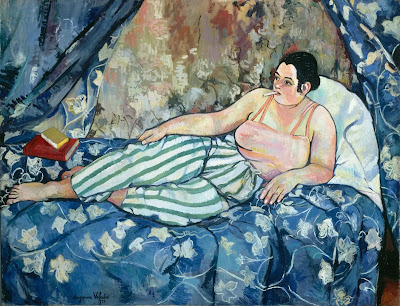
I was at the Barnes Foundation museum a year and a half ago to see its Suzanne Valadon exhibition. Interestingly, Valadon modeled for Renoir, before she became a painter in her own right. I compared her work with Renoir's

I also noted that the Barnes Foundation is known for having a huge collection of Renoirs. I imagined they wouldn't be pleased with the RSAP movement and its threat to their business model.

Well the Barnes Foundation is fighting back. Their post on Linked In (why Linked In?) says:
💡Did you know?💡 A lot of people love to hate Pierre-Auguste #Renoir. There’s even an Instagram account dedicated to him called “Renoir Sucks at Painting.” While it is debatable if he truly sucks, he undoubtedly occupies the strange position of being one of the most beloved artists of all time yet also one of the most reviled.

Join us online on Wednesdays, 5/3 – 5/24, from 12-2 pm, *live from the Barnes galleries*—home to the largest Renoir collection in the world (181 paintings, to be exact!) for #BarnesClass: In Defense of Renoir, to survey the artist’s paintings and discuss some of the specific criticisms they have inspired across the decades. We’ll consider this question: what if his work is more interesting than we thought?

After discussing Renoir’s theories of art, we will use deep-zoom technology to look closely (more closely than you ever thought you could get to a priceless painting, tbh) at several canvases to develop a better appreciation for his craftsmanship and how it reflects the values of the early 20th century.

Renoir haters will be encouraged to rethink their opinions—but are also welcome to dig in their heels! Register for this course today

On Instagram, the Renoir Sucks at Painting response includes a video by Martha Lucy, Deputy Director for Research, Interpretation & Education Barnes Foundation along with this comment:
Hey Everybody! This is actually happening! The @barnesfoundation has an online class all about Renoir and they’ve invited us to participate! Congratulations to us all. We are a part of Art History, and our ghosts will haunt the vibes of Renoir lovers for generations to come.
Each class will be cool and informative. And also funny. You can buy tickets at the link in the bio, and if you’re willing to subject yourself to the indignity of typing RENOIR4EVER into the discount code box at checkout, you’ll save 10%. 
Also! very important! If the cost, discount notwithstanding is prohibitive, dm me! I’ll gladly walk you through getting a full ride. These Barnes curators, cheeky though they might be, are really good about making sure this thing is accessible to all!

In her 2019 lecture available on YouTube, "The Trouble with Renoir" Lucy seems defensive and even a little whiny, and the title refers to "the trouble" that not everybody loves Renoir like Martha Lucy does.

She argues that because many critics of Renoir use food terminology it means that they are equating Renoir's work with pleasure and since the critics are suspicious of pleasure, that is why they don't like his work. 

What bullshit.

The RSAP gang use a great food-related word that perfectly captures the painful diabetic ketoacidosisness of Renoir's work: "treacle."

Later in the lecture, Lucy admits part of the trouble with Renoir is the vapid male-gaze nudes he painted during his creepy-old-man-going-blind late period. But then she tries to excuse it by claiming Renoir was being "subversive."

And claiming Renoir was a big influence on the hideously misogynist Picasso is not the slam-dunk she apparently thinks it.

On the plus side, the lecture alerted me to this funny piece in The Onion: Art World Relieved As Thieves Steal Pretty Terrible Late Period Renoir Work

Monday, January 10, 2022

From the sublime to the ridiculous at the Barnes foundation

Valadon

Well the Barnes Foundation had a huge success with its Suzanne Valadon show. 

It’s hard to believe that “Suzanne Valadon: Model, Painter, Rebel” at the Barnes Foundation is the first American museum show for this sensational French painter...

...The show at the Barnes, curated by Nancy Ireson, is a thrilling tour of her portraits, nudes, still lifes and drawings.

I saw the show in October, but it was right before Mr. Fuzz died and he was pretty sickly at that point, so I was preoccupied with worry about him and didn't really enjoy the show. I'm glad it got a good response.

So how does the Barnes foundation follow up a show about a painter who portrays women as individuals and does not flatter her subjects and uses firmly delineated lines?

Renoir
With her polar opposite, Renoir, in a "January Spotlight Tour" and just to emphasize the difference the tour is called "Renoir and Women." Just look at the difference between the image above and this one. Same subject, completely different approach, visually and emotionally.

The Barnes Foundation is heavily invested in the reputation of Renoir - it has the world's largest collection of Renoirs.


The NYTimes article about the Valadon show mentions that although the Foundation founder Albert Barnes had paintings by Suzanne's son, Maurice Utrillo, he had none by Valadon. No accounting for taste.

I have loathed Renoir since I got a good snootful of him in art school - I attended both the Pennsylvania Academy of the Fine Arts and the University of the Arts. So I was very pleased to see the "Renoir Sucks at Painting" movement which started a few years ago. They are still out there, primarily represented via an Instagram account. But they've actually done full-blown, in-person anti-Renoir demonstrations in the pandemic before-time.


I imagine the Barnes Foundation trustees were not pleased when they got wind of this movement in favor of good painting and against treacle.

Now I don't think every painting by Renoir is bad. I mean he only painted a zillion canvases, he was bound to do OK once in awhile. But his paintings of women were terrible because he was hung up on this "eternal feminine" bullshit. And most of his paintings were of women.

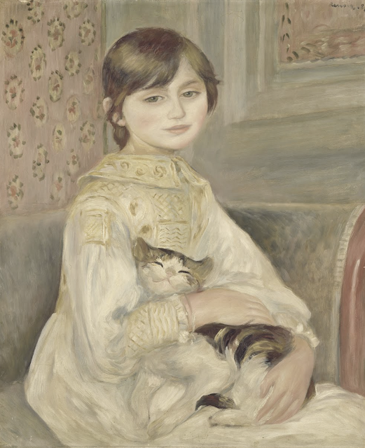
But this portrait of Julie Manet is pretty good. 

Partly because it was a portrait of the daughter of his friends, so she does - partially - escape the eternal feminine treatment. 

And partly because, without the usual riot of colors he used, he was forced to focus on draftsmanship.

Mostly though, because he did a great job with the cat. He should have painted cats more. 


But thanks to Julie Manet's diaries, we know what a great big honking anti-Semite Renoir was:
...she faithfully records — and concurs with — Renoir’s relentless anti-Semitism (shared, alas, by the great Degas): “Today I was at Renoir’s studio, where the talk is all about the Dreyfus Affair and against the Jews. ‘They come to France to earn money, but if there is any fighting to be done they hide behind a tree,’ said Monsieur Renoir. ‘There are a lot of them in the army, because the Jew likes to walk about wearing flashy uniforms. If they keep getting thrown out of all countries, there must be a good reason for it and they shouldn’t be allowed as much room here…. It’s unsinkable, the Jewish race. Pissarro’s wife isn’t one, yet all the children are, even more so than their father.’ ”
So fuck 'em both.

Unfortunately Degas was an anti-Semite too. But I left that out of my play. And he does come off as a bit of an asshole, the way I portray him. Even if he did love Suzanne Valadon's work.

Valadon painted cats too.


Saturday, January 05, 2019

Sophie Blackall and the 2016 Caldecott Medal Selection Committee

I thought it was odd that one of the worst professional illustrators I have ever seen, Sophie Blackall, won the 2016 Caldecott Medal for children's picture book illustration. Especially when you look at the vastly superior work of the 2016 runners-up.

I didn't immediately leap to the conclusion of cronyism when I heard the news. But after looking at the names of the people in the Medal Selection committee, I'm definitely considering it. The Chair of the 2016 selection committee was Rachel G. Payne of the Brooklyn Public Library.

I did a little research and it seems, if the online location sources are correct, that Blackall and Payne are neighbors - they live about a mile from each other in Brooklyn.

And they are also Facebook friends, although I don't know if they were friends before Payne gave Blackall the medal. It would be very surprising if they were not, since not only do they apparently live in the same Brooklyn neighborhood, they have both been to at least one conference at the same time prior to 2016.

Now it's possible that Payne and the rest of the selection committee simply don't know shit from Shinola, and that's why Blackall won the Caldecott, but I have my doubts now.

But again, if the awful Renoir is still beloved by the masses there is no reason why Blackall can't have a thriving, award-winning career forever. There will always be tasteless idiots to champion mediocrities while the vastly superior are ignored - superior artists like Mary Cassatt and Berthe Morisot.

There is no justice in this world. And plenty of bad taste. And cronyism.

This book...


...was judged better-illustrated than this book...


and this book...


and this book...


and this book...


...by the 2016 Caldecott committee. Completely insane.


Tuesday, January 01, 2019

Sophie Blackall and the surprisingly crowded genre of books for children about lighthouses

So I was talking about the inability of award-winning, yet still terrible illustrator Sophie Blackall to handle perspective in her illustrations for a children's book about a lighthouse. To my amazement I found a blog which has an interview with Blackall in which Blackall claims to have done a whole lot of research for the book. I guess that shows that all the research in the world cannot cure an inability to draw.

I've been criticizing Blackall's work long before she won the Caldecott medal in 2016. In 2012 I saw her banner image on the NY subway system and understood her true awfulness even then.

But it looks like I got my wish from this 2016 blog post when I speculated that winning a Caldecott would make Blackall focus on children's illustration. To the relief of all discerning adults.

Just for the heck of it I did some Googling to see how other picture books for children handled the topic of lighthouses. I found that all the artwork in this surprisingly crowded genre was better than Blackall's... well except one, which I will get to at the end.

Here are some examples of both more realistic and more stylized approaches to lighthouses for kids.

A convincing rendition of top-down perspective on a 
lighthouse by artist David Armitage showing it can be done.


This piece by Rosalind Clark might be the most similar in style
to Blackall's that I've seen but yet is so much less awkward.
I shudder to think how Blackall would handle the pose of
the girl on a hillside in this image.


A more realistic work by Elaine Wentworth -
Blackall couldn't do something this realistic
in her wildest dreams


Very stylized but vastly superior technique to Blackall by
Ingrid Godon. Appropriately for a children's picture book,
Godon gets top billing over "with words by Andre Sollie"
What an hysterical title for a kid's book though - love it.


A non-fiction book about lighthouses by Roman Belyaev who
truly understands perspective - stylized, precise and beautiful


Ocean by Emily Dove - so beautiful and graceful.
In a just world it would be Dove winning a Caldecott
medal, not a talentless hack like Blackall. And I bet
Blackall couldn't understand why this
is so much better than her work but then
that's what it means to be an exemplar of the
Dunning-Kruger effect - you don't know
that you're bad because you don't know what
makes something good.
More stellar work by Dove on her web site.


As promised here is the one lighthouse-related piece of children's book illustration that I think is worse than the work of Sophie Blackall.

Like Blackall, Elias is much better at drawing lighthouses than people.
One of the far-superior illustrators
who were runners-up to

the awful Sophie Blackall ~
I can't help but notice that
the chair of the 2016 Caldecott
medal selection committee,
Rachel G. Payne, lives in 
Brooklyn, just like Blackall. 

And BTW this page from the Caldecott site shows all the runners-up beat by Blackall, each and every one a far superior artist to Blackall. They must all be as flabbergasted by the loss as I am.

The problem with someone like Blackall, who can't draw well, winning the most prestigious medal in children's illustration is not simply an incompetent being told she's the best - it's all the truly talented illustrators being told that an incompetent is better than them. That's what really annoys me.

And also that subway card by Blackall in 2012 is truly, truly hideous. I hated being forced to look at it during my commute.

But I suppose it shouldn't be a surprise - if the truly awful Renoir is still considered a great master,  anybody could be.


Thursday, October 05, 2017

Renoir sucks at drawing too

Degas


Ingres
The Metropolitan Museum of Art is currently holding an exhibition of drawings, including work by Ingres, so I'm definitely going.

They also unfortunately include a drawing by Renoir which demonstrates that not only did Renoir suck at painting, he sucked at drawing too.

The drawing in the exhibition, the bottom image in this post, displays Renoir's faults evident in his painting, especially the stupid cow-like appearance of the subject's face and indifferent background and boneless body and indistinct fingers; and on top of those, this drawing also includes a bizarre right arm - not only much too long for the figure, but the upper arm is thinner than the lower arm.

In constrast to the Renoir are gorgeous drawings by Degas and Ingres. Two very different artists with very different approaches in the drawings, but both clearly far superior to Renoir. 

It's true that I have critiqued Ingres for weird-looking limbs, but every other aspect of his work makes up for it.


Renoir sucks at drawing too

Friday, September 01, 2017

Cassatt/Morisot vs. Renoir

The Met is not at all phased by Renoir-hating, obviously, since
they included this Renoir in a membership outreach email.
There doesn't seem to be much going on with the Renoir Sucks at Painting crew outside of their Instagram.

But their Instagram presents evidence connecting Renoir to white supremacists as in these hate mails from the Nazi web site Stormfront and Donald Trump's apartment.

Speaking of Nazis, it turns out Renoir was a bit of an anti-Semite as recorded by Julie Manet the daughter of another impressionist painter Berthe Morisot who was married to the brother of another impressionist Edouard Manet:
 ...Julie quotes Renoir as saying, “[The Jews] come to France to earn money, but if there is any fighting to be done they hide behind a tree… There are a lot of them in the army, because the Jew likes to walk about wearing a uniform”. During the same discussion, Julie notes that Renoir also “let fly on the subject of Pissarro, ‘a Jew’, whose sons are natives of no country and who do their military service nowhere”. Renoir goes on, “It’s tenacious the Jewish race. Pissarro’s wife isn’t one, yet all the children are, even more so than their father.”[15]
On another occasion, Julie quotes Renoir talking about how he “naturally” refused to sign a petition which the Jews and anarchists were signing for a reconsideration of the Dreyfus trial. During another interminable discussion, a “very worked up” Renoir observes that  “the peculiarity of the Jews is to cause disintegration”. On a later occasion he derides Gustave Moreau’s painting as “art for Jews”[16]. 
Renoir's comments about Jews sound exactly like contemporary bigots talking about Muslims.

All the other artists mentioned in this post are better than Renoir, but with the possible exception of Manet, Renoir is the most famous.

The Stormfront comments are idiotic and wrong-headed as Nazi comments will be. The one quoted by the anti-Renoir brigade says: "Renoir created beautiful works of art depicting happy, healthy White people enjoying life. That's why the anti-whites despise him..."

Of course this is blatantly false. Nobody is complaining about the art of Mary Cassatt or Berthe Morisot, who both painted the same exact subjects as Renoir. And yet Renoir is much more famous and revered than either of them. Max Geller, the leading anti-Renoir guy makes a good point:
“I think what’s important to understand is that Renoir actually does suck at painting, and there are plenty of female artists who never get hung in fine art museums because they’re dominated by males,” Geller said. “And if you’re going to dominate, territorially speaking, your walls with white male artists, I think you should make certain that they are good artists.”
And not only did Cassatt and Morisot paint the same kind of subjects as Renoir, sometimes they painted exactly the same subject.

Here are two pastel drawings of a woman in red with her dark hair up in a bun, breastfeeding.  The first is Renoir, the second is Cassatt. You can't get a clearer demonstration of the superior skills of Cassatt with the composition, choice of color, use of paint and draftsmanship. You can't compare the faces since Cassatt's woman  is turned away, but it's unlikely hers has the visage of a slow cow as Renoir's does.


And here are two paintings with similar compositions and (almost) the exact same subjects. The first is Berthe Morisot and her daughter Julie Morisot by Renoir and the second is a painting by Morisot of her daughter Julie and Morisot's sister-in-law, who would be around the same age as Morisot.

What a difference - Renoir's is flat in composition and color and lighting, while Morisot's piece has depth and subtlety. Renoir doesn't even attempt a background, content to make it his usual wash.
And you can see that Renoir, as he did with painter Suzanne Valadon when she was young, put Julie Manet through the Renoir-alizer and turned a thoughtful young woman into another generic smiling pretty girl-cow.

Well at least Julie got her revenged by recounting Renoir's anti-Semitism for the world.

Clearly Morisot and Cassatt handled the "white people having fun" every bit as much as Renoir, except they did it much much better. Which is why nobody is saying they suck at painting. But since Renoir had a penis he was and continues to be given much greater respect than either of these two female Impressionists.


Saturday, November 07, 2015

Blackall strikes again

Since I expressed my dismay over the work of Sophie Blackall three years ago, after I had a chance to examine it thoroughly thanks to its being shoved in my face constantly on my daily subway commute, I admit I haven't thought much about Blackall.

So when this image popped up in the NYTimes web site Friday, I glanced at it, and even before I read about the controversy surrounding the book, I was aware of a feeling of irritation. There was something about the figure... its tentative, half-assedness and simpering expression on the girl's face. So I checked the byline. And guess who turns out to be the illustrator of this book?
The book, “A Fine Dessert,” written by Emily Jenkins and illustrated by Sophie Blackall, shows four children at different points in history making a blackberry fool with a parent. The parallel stories highlight both technological changes in kitchens and the shifting social relationships that determined just who did the cooking.
Oh baby Jesus, Blackall is even worse at picking projects than she is at draftsmanship. Blackall defends presenting enslaved peoples in a cozy home-style American families scenario in a not-suprisingly-delusional way:
The dinner table scene is set up to show the deep injustice of the situation. The people who worked so hard over the dessert don’t get to eat it. A very small enslaved child pulls a cord to fan the white family throughout the duration of the dinner. The enslaved mother and daughter are somber and downcast...
 3) The act of having to hide in the cupboard to lick the scrapings from the bowl is the thing children have responded to most viscerally. They are horrified at how unfair it is. There is nothing whimsical about hiding in the cupboard. It conveys a complete lack of freedom.
In what world does Sophie Blackall live? No child is going to be able to understand just by reading this book that hiding in a cupboard is a horrifically unfair situation - kids often enjoy hiding out. They certainly aren't going to understand the significance of hiding in the cupboard.

Here is that page, which Blackall presents on her blog. What this demonstrates, more than anything else, is what a terrible artist Sophie Blackall is. I recommend you click the image to get the full effect of her ineptitude.


Note the little boy on the right with his feet aligned on the same exact plane, as if an ancient Egyptian tomb painting - something she does not do for the woman on the far left, so it isn't a consistent style choice. 

Speaking of inconsistency, there's the matter of Blackall's handling of fabric patterns. She manages to make the stripes conform to the draping of the curtains at the window, but when it comes to patterns on clothing, just forget it - she draws straight vertical lines down the dresses of the slave woman and girl in defiance of the contours of the clothing.

And then there is the two legged-table in the lower-left corner. I suppose it could be a two-legged wall-mounted table, but the leg is a couple of inches away from the wall, while the top of the table appears to go at least half a foot beyond that leg, right into the wall. So maybe it's a curved-inward wall. That's the only logical answer. 

And then there is the matter of the red fabric cord the boy is pulling, which appears on the verge of going up in flames. If I was a kid that would be the first thing I would notice.

Three years after I critiqued her subway poster Blackall still hasn't become acquainted with human anatomy - once you notice the freakishly-elongated upper arm of the woman on the right you cannot unsee it. To get a sense of the failure, note that the elbows of the people with their backs to us line up with the second-down cross-piece on the back of the chair, while the elbow of the woman on the right lines up with the fourth-down crosspiece.

Blackall describes the expressions of the slave mother and daughter in this picture as "somber and downcast" - which is perhaps what Blackall was going for. It is not what she achieved. The little girl appears to have a smile, probably due to Blackall's inability to draw faces from that angle. And as far as the mom, she has the same expression on her face as the women in this medieval illumination. Surely the medieval artist meant to convey horror at being handed a freshly decapitated human head. Like Blackall he has not succeeded in the realistic presentation of human emotion.

Clearly Blackall graduated from the the same school of anatomy as Renoir. Although I imagine Blackall is not at all displeased by the comparison, thanks to the Dunning-Kruger effect, and because in spite of Renoir's inability to draw, he made a living as an artist too.

And don't even get me started on the tablecloth. I don't have all day.

Wednesday, October 14, 2015

At last it can be said: Renoir sucks at painting

I've disliked the work of Renoir since art school, and thanks to this article in the New Yorker, I realize, at last, I am not alone. Apparently there is an Instagram called Renoir Sucks At Painting.

The New Yorker article is very pro-Renoir. So much so that the author, Peter Schjeldahl, suggests there is something wrong with the character of those who do not like Renoir:
In the second class of people who like Renoir are those who have stopped fortifying their self-esteem with pride in their sophistication. You recall with indulgence, and may renew, the joys of your innocence. And liking what others like comes to seem more a happiness than a humiliation. Lord knows you’re lonesome enough in other respects. 
Renoir painted very well when he cared to. (Ask any painter.) He did so in radical ways imported from outside academic convention—from his first profession, as a decorator of porcelain china. His style never forgets the charm of imagery glazed onto vessels. It’s true that his compositions tend to be slack. He was indifferent to the corners of rectangular canvases. It helps, when looking at his pictures, to imagine them as flattened convex surfaces. 
Renoir’s popular appeal advanced the bourgeois cultural revolution that was Impressionism. He junked the aristocratic airs that linger in Degas and shrugged off the plein-air product lines of Monet. (They’re great, too, of course.) His art was from, for, and about the delights of an ascendant class. His exaggerated blush and sweetness make sense as effusions of triumphal exuberance. 
Have the R.S.A.P. members ever truly looked at Renoir’s “Dance at Bougival” (1883) in the Boston M.F.A.? A raffish guy swings a lovely girl—Suzanne Valadon, the artist’s model and mistress, and later a distinguished painter herself—at a summertime outdoor café, redolent of heat, music, smells, and light sweats of exertion and desire. Cigarette butts litter the floor at their feet. This is no candy-box fantasy. It is the real life of real people in a real place, glorified. Modernity is dawning. There’s a beat to it, and a glow.
If you must hate yourself a little for loving Renoir, do so. You’ll get over it. And, when you think about it, who’s keeping score?

Who's keeping score? Apparently you are, Peter Schjeldahl.

But now that I am an official member of R.S.A.P., let me take his advice and truly look at Dance at Bougival, at least a digitized version. Schjeldahl notes that the woman portrayed is modeled on Suzanne Valadon. Here is a photo of Valadon two years after the Renoir was painted.


Quite a strong character even just sitting for her photo portrait. Here is how Renoir portrays her in Dance at Bougival. Valadon has been transformed into a pretty plump party girl, one of Renoir's generic boneless heifers. 


Here is how Valadon was portrayed by Henri de Toulouse-Lautrec, also an Impressionist.


And if you think it's unfair comparing Valadon as a dancer to a Valadon portrait, here's a portrait by Renoir of Valadon.


Which portrait captures the essence of Valadon and which one says: "this is what pretty girls look like to me"? This is how Valadon portrayed herself, along with her 21-years-younger husband (on the left), her mother and her son.


To Renoir Valadon wasn't an individual, she was a pretty girl.

And it isn't just in portraiture that demonstrates Renoir was the least of all the Impressionists. Here is a dancer painted by Renoir, and another painted (in pastels) by Edgar Degas. If you can't see that Degas is the better draftsman, colorist, stylist and conveyer of humanity, well I don't know how you can't. Of course tastes vary, but then I don't claim that if you like Renoir it says something about your character.


Thursday, December 04, 2014

A moment of art appreciation

Click to see a much larger version of this painting.
The news lately has been so disgusting, with the killer police and rape colleges, I don't even know what to say about it all.

So it's time for some art appreciation.

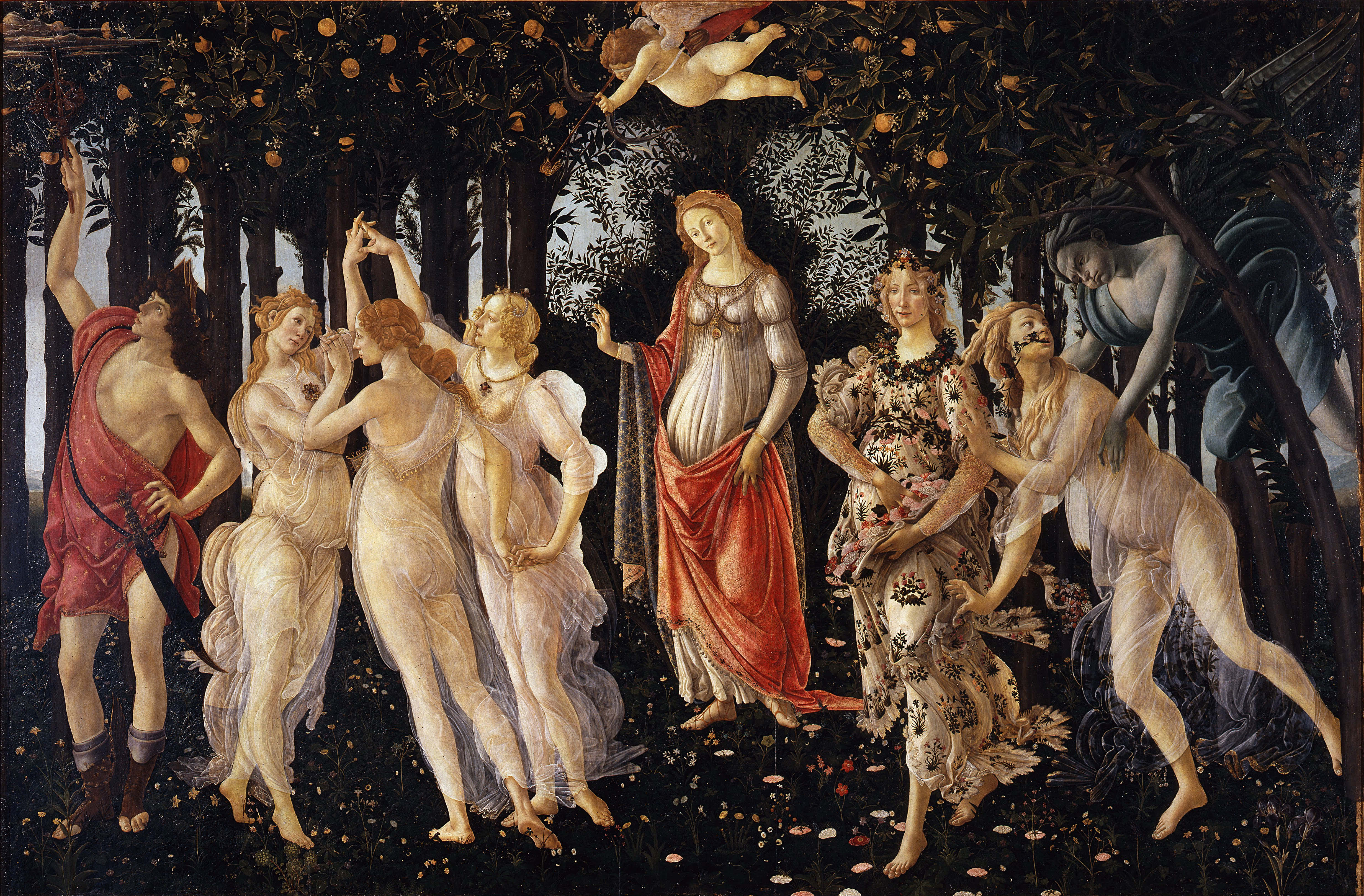
Botticelli's La Primavera ("Spring") is one of my favorite paintings for several reasons - for one, it's very theatrical, with the cast arrayed within the setting like a stage, with the diva, Venus, in the center. Also there's the anticipation of action, with Cupid above, about to shoot somebody with a love arrow.

I also like the color composition. I have a copy of this painting in my apartment, although unfortunately the colors on the red end of the spectrum have faded (I guess it was a pretty cheap print) and so the whole thing has turned to blue, and only the drape of Mercury (the stud on the left) and Venus are at all reddish. However, it's not so bad - if this were a painting by Renoir it would be a disaster - his work is mostly about color, but Botticelli was big on line as much as color - so the print can still be appreciated for the grace of the line, which becomes more prominent with the greater color monotony.

Art historians are still not sure exactly what this painting is about, although the most popular is some kind of mythological allegory. As Wikipedia says:

Venus presides over the garden - an orange grove (a Medici symbol).[9] She stands in front of the dark leaves of amyrtle bush. According to Hesiod, Venus had been born of the sea after the semen of Uranus had fallen upon the waters. Coming ashore in a shell she had clothed her nakedness in myrtle, and so the plant became sacred to her.[10]The Graces accompanying her (and targeted by Cupid) bear jewels in the colors of the Medici family, while Mercury'scaduceus keeps the garden safe from threatening clouds.[7][9][8]
The basic identifications of characters is widely embraced,[11][12][13] but other names are sometimes used for the females on the right. According toBotticelli (1901), the woman in the flowered dress is Primavera (a personification of Spring) whose companion is Flora.[14] The male figure is generally accepted as Mercury but has been identified as Mars by Beth Harris and Steven Zucker of SmARThistory.[15]
I've been told I resemble one of the characters in this painting, but I won't say which one. One of the female ones though, fortunately.

Friday, October 26, 2012

Bonjour Biqui, Bonjour

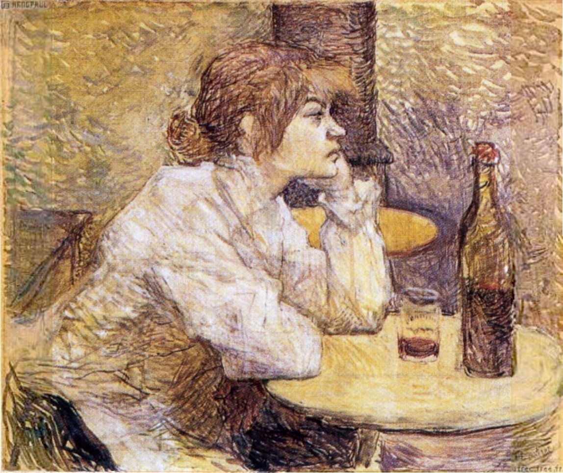
Portrait of Suzanne Valadon "The Hangover" by Toulouse-Lautrec
Suzanne Valadon ("The Hangover")
by Henri de Toulouse-Lautrec
I first heard of Erik Satie through Suzanne Valadon. Neither of them are household words, but these days Satie is much more famous - certainly more famous than the music teachers who told him he had no talent and no future in music. This upset Satie so much he joined the army - and if there was ever anybody unsuited for the army it would be Erik Satie, one of the most eccentric persons of all time. It was predictable that he would find a way out of it - although infecting himself with bronchitis was an original touch.

You have heard the work of Erik Satie because the first of his Trois Gymnopedie is used all the time. I first heard, and was enchanted by it, because it was played at the end of My Dinner with Andre. You can listen to it here:


But much of his work was idiosyncratic and experimental and only popular among the French bohemians - which is why he was usually so desperately poor. He ended up being a huge influence on John Cage and John Cale (of the Velvet Underground.)

Cale apparently performed Satie's Vexations and then went on I've Got a Secret to try to stump the panel - they figured it out pretty quickly though. You can watch that episode here:


They never actually mention Satie's name in this entire clip.

Allegedly Vexations was written in response to Satie's break-up with Suzanne Valadon, although it's speculation since nobody ever saw the piece until after Satie died and they guessed it was a response to the break-up based on the date of composition.

But I knew of Suzanne Valadon first because she was one of the rare famous female painters in art history - a subject of great interest for me, since I planned to be a visual artist since early childhood and was desperate for female role models.

I knew who Mary Cassatte was, but she was so conventional: upper-class and personally conservative. Quite possibly a life-long virgin. But Suzanne Valadon! As Wikipedia notes:
A free spirit, she wore a corsage of carrots, kept a goat at her studio to "eat up her bad drawings", and fed caviar (rather than fish) to her "good Catholic" cats on Fridays.
Erik Satie
by Suzanne Valadon
She wanted to be an acrobat but was injured in a fall. She became an artist's model and then an artist.

She married a stockbroker for a brief brush with respectability but then left him for her son's best friend who was half her age. Picasso and Degas were good friends of hers - and the word is she had an affair with Renoir.

Clearly this bohemian was as close to a perfect match as Erik Satie was ever likely to meet. But I should never have read about them in the middle of the business day:
Satie and Suzanne Valadon... began an affair early in 1893. After their first night together, he proposed marriage. The two did not marry, but Valadon moved to a room next to Satie's at the Rue Cortot. Satie became obsessed with her, calling her his Biqui, and writing impassioned notes about "her whole being, lovely eyes, gentle hands, and tiny feet". During their relationship, Satie composed the Danses gothiques as a kind of prayer to restore peace of mind, and Valadon painted a portrait of Satie, which she gave to him. After six months she moved away, leaving Satie broken-hearted. Afterwards, he said that he was left with "nothing but an icy loneliness that fills the head with emptiness and the heart with sadness"  It is believed this was the only intimate relationship Satie ever had.
Right in the middle of my office cubicle I cried for Erik Satie.

Satie died of cirrhosis of the liver due to alcoholism at the age of 59. I'm sure his diet didn't help either - he only ate white foods and avoided the sun. He probably had massive vitamin and iron deficiencies.

Here is the piece that Erik Satie wrote for Valadon during their affair, called Bonjour Biqui, Bonjour. It is only four bars long.


Here is the sheet music.

The entire score of "Bonjour Biqui, Bonjour"
As I mentioned four and a half years ago on this blog, I am a sucker for art inspired by love.